The TWPToolbar is a practical component to quickly add a user interface to a TWPRichText component.
Simply add a TWPToolbar on the form and set the property TWPRichText.WPToolbar to point to it.
This will show an old fashioned toolbar :-)

The icons you see are compact 16 color glyphs loaded from a resource file.
But for most projects you will probably want more modern looking icons.
Also you probably want to be able to change the size of the buttons in the toolbar.
For best quality and compatibility to older versions of Delphi the TWPImageList is used. This components contains a list of images, each of which is made from multiple glyphs.
The order of the images is fixed (top left to bottom right). We choose not to use single glyph files, since those are too hard to maintain - it would be required to add up to 190 files for each supported resolution to a program!
If you need to update an image, we recommend to use a program such as Affinity Designer (“Serif” and “Affinity” are both registered trademarks of Serif Europe Ltd). Our WPTools Premium Edition also includes the SVG version of the bitmap file so you can edit the icons without loss in quality.
How to use TWPImageList:
Alternative A: Simply add the unit WPIcons to your project.
This unit initializes a global instance of TWPImageList "glWPImageList" and then loads a set of resource files. This global instance will be used by all TWPToolBar components which do not use the property WPImageList.
You can edit the file WPIcons.pas to select which resource files should be loaded.
Alternative B: Simply drop this component on a form or datamodule.
Then double click on it to show a open file dialog. There select all (multiselect) the image files you want to use, i.e.
WPToolsIcons_22 png, WPToolsIcons_24 png, WPToolsIcons_32 png ...
This will create an item in the Images collection for each file you add. The logic will extract automatically the width and height from the name of the files, in this case 22, 24 and 32.
You can also add the files at runtime using the method AddFromFile.
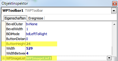
Now set the property WPImageList of the TWPToolBar to point to the WPImageList component.
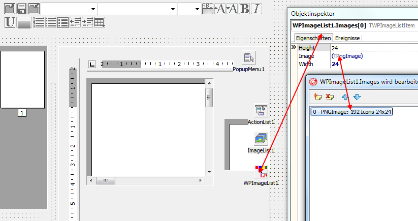
This is how the TWPImageList is selected by the TWPToolbar.
The property "ButtonHeight" in TWPToolbar and the defined item height of the image-list items must match. If "ButtonHeight" is larger, the next smaller images from the list will be used.
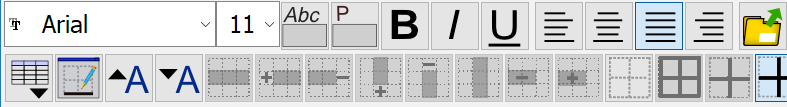
Depending on the selected ButtonHeight, the buttons will now use one of the provided images - and the toolbar will now look like this:

or, at higher resolution:
The toolbar can also display the current used colors in the buttons for paragraph, text and highlight color.
To enable this mode, a WPImageList must be used and the property WPImageList.GlyphColorRect.Enabled must be set to true.
If you do not want to create an instance of TWPImageList, simply add the unit WPIcons to your project.
This unit initializes a global instance of TWPImageList "glWPImageList" and then loads a set of resource files. This global instance will be used by all TWPToolBar components which do not use the property WPImageList.
To make all TWPToolBar instances use your WPImageList by default, assign its reference to the global variable glWPImageList which was defined in unit WPCTRRich. |