The <toolbar>, <panelH1>, <PanelH2> (reserved), <PanelV1> and <PanelV2> tags are placed in the branch <main>. They are used to define the respective toolbar or panel.
As parameter btnframe, hoverframe (see above), ShowCaption and color can be used. <ToolBar Color="Red"> will create a completely red toolbar. This will only work if the global design has been set to "simple".
The parameter ShowCaption selects if the buttons should be displayed with a caption or not. 0 will disable the captions, 1 will enabled the caption. ShowCaption can be used with each button or group to override the setting made here.
The parameter columns=x can be used to limit the count of buttons displayed horizontally.
Inside the definition the following tags can be used:
<images/> - same use as in <layout>
<design/> - same use as in <layout>
<button> - define a simple push button.
The following parameters can be used:
Image=X X is the image number in the image list. The value -1 will disable the image.
Note: The EditLayout XML Editor will always display the image list which was opened last on the right hand side. This helps to use the right image index for the button XML tags.
ShowCaption=X Override the standard for this toolbar or group to display (X=1) or hide (X=0) the caption.
wpa=name This selects the "wpa" action for this object, for example wpa="Left". (See List) If you do not specify an action the event OnButtonClick will be triggered when the button was clicked. (Note: This string value will be stored in property Action, unless the parameter Action is used)
An action will also select a localizeable caption and hint. Both can be overwritten using the following 2 parameters:
Caption=text Selects the caption for this button.
Hint=text Select the hint for this button
Action=text Set any name of a custom action. The name can be retrieved using the property Action.
Font=fontname Select a certain font name, such as WingDings
Param=text This is an optional string parameter - it can be used by the action or inside the OnButtonClick event.
IParam=X This is an optional integer parameter
Name=text The name of this element, optional for OnButtonClick event. (It is not set by the "wpa" parameter)
ifselected=no/yes Used for popup menu items only. The menu is hidden if text is currently selected / not selected.
A button can also have subitems. In this case a drop down field will be displayed and the subitems will be displayed in a drop down panel. The parameter ShowCaption can also be used with the <subitems> tag.
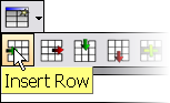
<Button image="56" wpa="CreateTable">
<subitems>
<Button image="64" wpa="InsRow"/>
<Button image="65" wpa="DelRow"/>
...
</subitems>
</Button>
Alternatively a button can display menu when the user clicks. Menus are created using the nestable <menu> tags which use the same parameters as buttons (caption, wpa, ...).
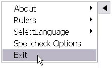
<Button image="97">
<menu caption="About" hint="This shows a popup menu!">
<menu caption="PCC package file"
wpa="DiaMessageBox" param="some text"/>
<menu name="about" caption="This APP"/>
</menu>
<menu caption="Rulers">
<menu wpa="SelectLanguage">
<menu caption="German" wpa="SelectLanguage" param="DE"/>
<menu caption="English" wpa="SelectLanguage" param="EN"/>
</menu>
<menu wpa="DiaSpellOptions"/>
<menu name="exit" caption="Exit"/>
</Button>
<collection> - create button with sub elements. The image of the first selected subelement will be displayed.
Example, the paragraph alignment button:
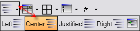
<Collection>
<subitems ShowCaption="1">
<Radio Image="12" wpa="Left"/>
<Radio Image="13" wpa="Center"/>
<Radio Image="14" wpa="Justified"/>
<Radio Image="15" wpa="Right"/>
</subitems>
</Collection>
<check> - create a selectable button - uses the same parameters as <button>
<radio> - creates a selectable button. If selected all others in same group are deselected - uses the same parameters as <button>
<dropdown> - create a button with drop down menu. Use the parameter wpa=name to select the action, for example fontcolor, fontbgcolor or parcolor.
<dropdownlist> - create a combobox - Use the parameter wpa=name to select the action, for example font or fontsize.
<seperator> - seperator item
<text> - just a label. It can use the wpa parameter if the caption should be loaded from the action description.
<group> - define a group of buttons - this is usefull with the <radio> objects.
To temporarily comment out a definition we recommend to preceed the tagname with a minus or underline character. The tag will not be recognized as mistake whe parsing the XML - but please don't forget to modify the closing tag as well.
Important:
| • | Tags without contents should be inserted as closed tags: <images .../> |
| • | Do not forget to close tags. If the toolbar does not show all buttons which were defined, it is likely that one button tag was not closed. |
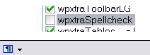
| • | If either your development license does not include a certain feature (i.e. PDF creation or spellcheck) or the feature has not been enabled using SetEditorMode(), the buttons which are connected to this feature will be automatically hidden: |
Spellcheck enabled: 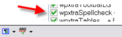 and disabled: