WPTools contains a complete set of component to quickly build a user interface.
You can use the ready-to-use TWPToolbar to create an editor within 5 seconds, or you can use the action classes and your own choice of tool buttons to let the user change the attributes of the text.
a) Toolbar Components
The tool-bar components (TWPToolBar and TWPToolPanel) can be attached to any TWPRichText component using its property WPToolBar. If you have more than one use the propety WPToolBar.NextToolBar to connect to the next toolbar in the chain. When the TWPToolBar is used on a MDI child window you need to set the global variable WPIsMDIApp := true;
 TWPToolBar
This components makes it easy to start a new program which uses a TWPRichText component.
You only have to activate some flags in the object inspector and the TWPToolBar will display action and status buttons and some combo boxes to select the font or color of the text in the TWPRichText control.

WPTools implements:
a) Buttons to Grow/Shrink Size
b) property DrawOptions allows adaptation of background color to ruler and editor
c) property ConfigString - it holds the selection and order of the buttons and combos which can be set and arrange in property editor (double click on toolbar!)
When ConfigString is not empty, the "old" sel_.... properties are inactive.
d) property ActionList. The included actions will also be available in designtime ands runtime customization
e) customization at runtime is possible: WPToolbarConfigurate( WPToolbar1, Self, 'Configure Toolbar' );
f) property WPImageList to provide images for different button heights and as PNG data.
Please see chapter TWPToolbar and custom icons.
The toolbar can also display the current used colors in the buttons for paragraph, text and highlight color.
To enable this mode, a WPImageList must be used and the property WPImageList.GlyphColorRect.Enabled must be set to true.
If you do not want to create an instance of TWPImageList, simply add the unit WPIcons to your project.
This unit initializes a global instance of TWPImageList "glWPImageList" and then loads a set of resource files. This global instance will be used by all TWPToolBar components which do not use the property WPImageList. |
 TWPToolPanel
Contrary to the toolbar, which creates and positions the buttons automatically, with the tool-panel component you have to drop the buttons in place. This gives you more freedom in the design of the user interface.
 TWPComboBox
This components can be used together with a TWPToolPanel or TWPToolCtrl. It can control the font, font size or colors of the text - to select the mode use the property ComboBoxStyle.
You can also use this control on a different toolbar or ribbon, if you create a TWPToolsCustomEditControlAction as link.
The TWPToolsCustomEditControlAction is attached to the TWPRichText by a regular ActionList which is referenced by the TWPRichText's property ActionList. Inside the action list you need a TWPToolsCustomEditControlAction for each of the combos. The property AttachedControl must reference the combo, the property AttachedControlStyle is ignored.
 TWPToolButton
This components can be used together with a TWPToolPanel. It can then execute certain functions of the attached TWPRichText or it can be used completely independently to execute custom code.
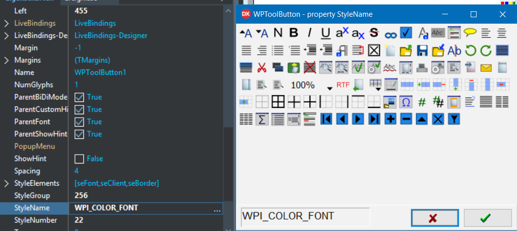
The action is selected by the property StyleName which has a property editor, see below.
The TWPToolButton can be used like a regular SpeedButton with the benefit of an attached ImageList. It can be connected to a TWPImageList using property ImageSource. If property ImageStretch is true, the image will be streached to the size of the button.
Please see chapter TWPToolbar and custom icons.
If the TWPToolButton is used with a WPImageList, it can display two glyphs from it. One as background, if property ImageBackgroundMode=wpImagebackground, which is selected by property ImageBackgroundNr. The regular glyph is selected by property ImageNr.
This is the property editor for "StyleName". It lets you select a standard action of the TWPRichText. It will also select the predefined glyph by changing the property ImageNr. You can override this setting though. The buttons will only be all shown if there is a filled WPImageList, ether attached as property ImageSource or attached to a parent TWPToolPanel.
The tool buttons can also display a color overlay rectangle. The color, if not clNone, has to be set in property ImageOverlayRectColor. The color rectangle has to be specified in the WPImageList component, property GlyphColorRect.
In case you set UseOwnGlyph to true, the bitmap saved in Glyph is saved and loaded from DFM and painted. The property NumGlyphs informs the component in this case, just like with the TSpeedbutton, about how many different display versions are stored in the bitmap. In case of the standard wptools resource there are 2, one for the normal, and one for the disabled mode. So please set the value to 2 if you see 2 icons side by side.
Note: The TWPToolBar creates its own buttons - you usually don't need the TWPToolButton control.
b) Work with Actions
 TActionList
Actions objects are uses to connect menu items and buttons to a certain procedure of the TWPRichText editor.
The TActionList which contains the action objects must be specified in the ActionList property of the TWPRichText component.
To add an action to a ActionList please open its editor (double click) and select 'new standard action'
Tip: In case you find out that certain hot keys do not work please check the short cuts defined in action lists or menus. It is possible that a shortcut is consumed somewhere else.
Assigning an action to a menu item always overrides the image index of this element. So please specify the image index values in the actions and not in the menu items. The image list must be assigned to both, the action list and the toolbar!
With WPTools 9 and Delphi 10.3 or later you can assign a WPImageList to a standard TActionList and the actions will use the glyphs stored in the ImageList.
Work with TWPComboBox
The TWPToolCtrl component is not included in WPTools Version 9. If you want to use the TWPComboBox control which can display a list of fonts, colors or styles, You need to create a links using the TWPToolsCustomEditContolAction action class.
This action class is created in the ActionList and its property AttachedControl is set to the TWPComboBox instance you need to attach. The property AttachedControlStyle to select the functionality is not used for TWPComboBox - they have their own property ComboboxStyle for the same purpose. (See ribbon demo)
Create shortcuts, such as Ctrl+I to activate/deactivate ITALIC:
To do this You can use the event OnKeyPress.
procedure TForm1.WPRichText1KeyPress(Sender: TObject;
var Key: Char);
procedure ToggleStyle(sty : TOneWrtStyle);
begin
if sty in WPRichText1.CurrAttr.Style then
WPRichText1.CurrAttr.DeleteStyle([sty])
else WPRichText1.CurrAttr.AddStyle([sty]);
WPRichText1.SetFocusValues(true);
end;
begin
if Key=Char(Integer('B')-64) then // Ctrl + B
begin
ToggleStyle(afsBold);
Key := #0;
end else
if (Key=Char(Integer('I')-64))
and (GetAsyncKeyState(VK_CONTROL) < 0)
then // Ctrl + I but NOT TAB
begin
ToggleStyle(afsItalic);
Key := #0;
end else
if Key=Char(Integer('U')-64) then // Ctrl + U
begin
ToggleStyle(afsUnderline);
Key := #0;
end;
end;
Note
Please do not use actions if you want to execute certain methods of the TWPRichText component from your own code. You can call the procedure directly (i.e. WPRichText1.Save) or change text attributes using CurrAttr (i.e. WPRichText1.CurrAttr.AddStyle[afsBold]).
Also see "Toolbar and Actions, OnOpenDialog".